Reviews
|
|
Live Review!We made a video of us reviewing our OTS live! It gives our immediate reactions to the story and gives an outlook of what we would improve, or didn't like about it. It also shows how we have progressed as a team and how our knowledge of media has improved since the start of the course.
(EP) |
Review 1
What did you like about it?: I thought the quality of acting was good as they gave good impression and made it believable that an evil was present and the argument at the beginning had decent dialogue and despite it being cliché it served the plot well and was a seen simply as a kind exposition. The setting I also liked as despite it being in the day the use of the forest I believe made up for that as the fear of being lost while being stalked was scary enough. My favourite part was the representation of the killer and how we gave him a more 3-Dimensional motive, the motive itself I also like as I feel its quite original and creative the idea of couples splitting is also relevant to today's society as divorce is more common than ever. Going back to the representation of the killer in his mind was also good as we were able to represent him in two ways on the outside him being professional despite the fact we don't see him we get that impression due to his ghost like presence and in the mind the setting reflects him as a fragile disillusion serial killer which the message being that all killers who ever they may appear on the outside are all the same on the inside. In many cases I enjoy the editing as the killer mind shots have been well placed in the sequence becoming more frequent as it builds up to the climax and finally the ending shot I also liked as it zoomed out revealing a lot of victims the shot itself making the scene have a bigger impact on the viewer.
What didn't you like about it?: The soundtrack I didn't think served the opening title sequence to well as rather than creating atmosphere for the various scenes it only succeeded in forcing what feeling we wanted the audience to feel primarily being fear, rather than allowing those feeling to come naturally through the actions shown through the sequence. I also disliked many of the sound effects which were supposed to be the indication of the killer but could also be mistaken for a small animal in the bushes, I didn't like these as I felt they were loud or scary enough to catch the attention of the protagonist and therefore the audience, this then leading to an overreaction from the protagonist which severed only to lesson the scary atmosphere. Another bit of the soundtrack in particular I disliked was the over shoulder reveal shot of the bag when the shock soundtrack came in, I disliked this because like my force point it was trying to force the situation on the viewer rather than allowing it to come naturally, I also felt it was a bit to silly and therefore ruined the atmosphere. The pace of the sequence I felt to be poor as it seemed to be all over the place as the build up is more sudden rather than its intended subtlety, this is partly down to the soundtrack as it fits in poorly with the situation. Finally i am going to comment on the chase scene the shots themselves I like but the urgency in the atmosphere is lacking i believe as i feel there is no tension this is probably due to the fact that these are sites of activity and therefore the viewer doesn't really care about them.
Overall Rating out of 10!:I am going to give it 6/10 as I feel it was shot well,edited well and also acted well, but i felt it lacked in the most important area and that is it wasn't scary though the ideas were good when put in practice i felt it lacked a lot of atmosphere and the in general it seem confused about what it was going for.
Review by William Turner
Review 2
What did you like about it?: I really enjoyed the storyline of the opening as it gave quite a different aproach than most generic horror. The fact that there was no definite killer made the deaths more interesting, as you were unaware of what happened to the victims or who killed them. I also liked that it paid homage to The Ring (2002) which has a similar ending to it's opening title sequence. I thought the setting and lighting was very effective because it made the sequence very eerie, as you were unaware of what was to happen next. I also like the idea of a non linear approach to the opening as it made the backstory more interesting. The shot at the end of the sequence is particularly effective as the zoom out of the couples faces shows the amount of times this person has killed. This also makes the idea of reuniting couples in death more sinister. I also thought the acting was very effective and made the sequence more believable from the point of view of an audience.
What didn't you like about it?: I disliked the lighting as even though we were restricted by technology, it would have looked better if it had been shot at night. The fact that is is in the middle of the day detracts from the overal sequence and makes it less menacing. I also thought the conversation between the two characters could be improved as the dialogue was very dry and cliché. The soundtrack could have had a vast improvement due to the fact that it didn't add anything to the overal sequence. If anything it made the sequence less terrifying, as silence usually helps create fear and tention. One specific use of sound that i didn't like was when there was a crane shot over the head of the female character. This cartoonish sound effect made the sequence seem more of a comedy than a horror.
Overall Rating out of 10!: Overal I give it 8/10 as i think that it has been very well shot and edited, however the soundtrack was too distracting and needed a lot of improvement.
Review by Emily Poole
Review Questionnaire
We did a questionnaire about our opening title sequence. We got people who had watched our OTS and asked them six questions which relate to six factors which we believe make a good opening title sequence. We asked people to give a mark out of 10 for acting, editing, sound, lighting, setting and camera shots. After we had asked 50 people i put the information into a excel document and created six bar graphs, one for each of the questions we asked. Below are the results that we had, we have also scanned in the question sheet that we used to collect the information.
We did a questionnaire about our opening title sequence. We got people who had watched our OTS and asked them six questions which relate to six factors which we believe make a good opening title sequence. We asked people to give a mark out of 10 for acting, editing, sound, lighting, setting and camera shots. After we had asked 50 people i put the information into a excel document and created six bar graphs, one for each of the questions we asked. Below are the results that we had, we have also scanned in the question sheet that we used to collect the information.
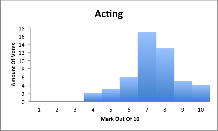
This is the bar graph for acting, most people gave it a 7/10, a lot of people said this was because our female lead was very good which is most probably dude to her taking drama A-level and that our male lead wasn't as good, but people did say that he had done well for his first male lead. People who gave higher marks argued that they felt like it was very realistic and said that they had portrayed the relationship between the characters very well.
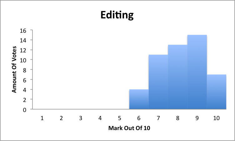
This is the bar graph for editing, most people gave it a mark of 9/10. People said that it was very well edited and all of the clips flowed well into one another and there were good sound bridges., they also said that they liked the colour correction used in the killers den. People who gave lower marks said that they felt a couple of clips were a bit long and could have been shortened.
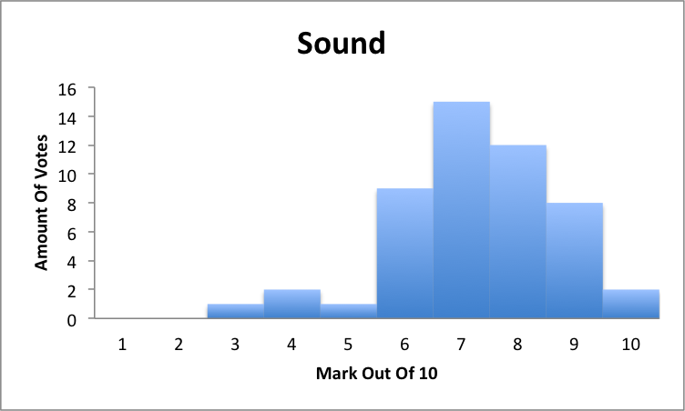
This is the bar graph for editing, most people gave it a mark of 7/19. People said that the non-dietetic sound fitted well with the sequence, although some people said they would have preferred a soundtrack which went throughout the whole scene. This is partly why sone people gave it a lower nark as we didn't use much sound.
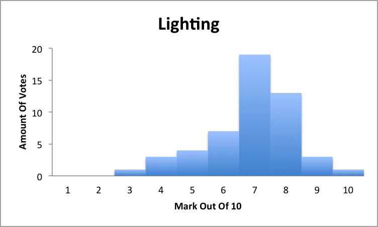
This is the bar graph for lighting, most people gave it a mark of 7/10. Most people said that the time of day we filmed added to the effect of actually filming in a forest, but we filmed during the day and used colour correction which made it look like we filmed it later in the day. Some people gave us a low mark as they said that we didn't use colour correction which is true as we didn't feel like we needed any extra lighting.
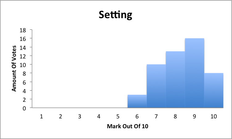
This is the bar graph for setting, most people gave it a mark of 9/10. People liked the setting of a forest we used, it is a naturally scary place and is a common place of a killing scene in horrors due to it seeming like it is far from civilisation. The setting also made the plot seem believable, this is due to our actors being lost so it makes the audience actually believe they are lost.
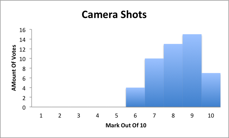
This is a bar graph for camera shots, most people gave it a 9/10. People really liked the couple of crane shots that we used in the opening title sequence. Some people also enjoyed the horror 360 shot, it portrays the illusion that the killer is there but you cant see him which makes it scary.
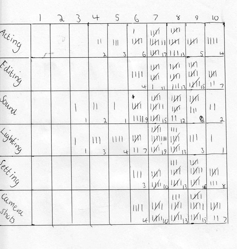
This is the sheet we used to record all our data from our questionare , we felt the best format for the data was grid as we did it in a checklist. We questioned people on Acting, Editing, Sound, Lighting, setting and camera shots to find an overall opinion of our OTS.
(EP, WT, HC, NL)
