Font Choice
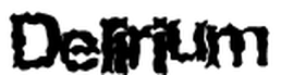
We chose against this font style as it was to cliche and did not properly reflect the style of horror we were trying to reflect through our intro. Also the font is hard to read as the letters are distorted and overall it looks really stupid.
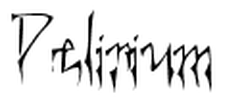
This is a an improvement on the first but is still lacking the sophistication that we are looking for, the text is too thin and still hard to read. Once again it doesn't fit our representation of our horror rather than a more parnormal feel it has a sinister feel to it.
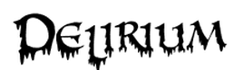
This is to cartoonish and not serious enough thereby taking the atmosphere from the whole sequence, thereby making people not take it as seriously. along with that it does not give the right impression as the melting effect could be interpreted as blood which is is not what our vid wants to be affiliated with.
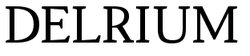
This is more what we want as its bold, all the characters are the same size and its also easy to read. what we want from not just the name of the title but also the style is to reflect the antagonist who is professional but also somewhat mysterious. out of all of them its is the best,mostly due to its simplicity.
(W.T)
(W.T)
