Production Company research
(NL)
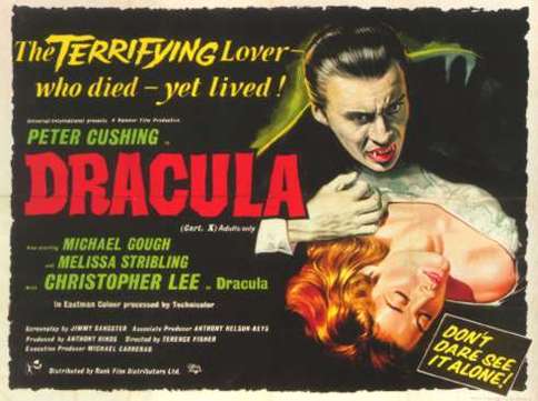
Hammer Productions
Hammer films was founded in 1934, but did not start producing horror films until the late 1950s. In the 50s and 60s it is responsible for many of the Frankenstein movies such as the 'Curse of Frankenstein'(1959) ,'Dracula' (1958) and 'The Mummy' franchise (1999-2008). More recent films include 'The Woman in Black' (2012), 'Wake Wood ' (2010) and 'let me in' (2010). The logo unlike others is more suttle as it resembles a the marvel comics logo and at first glance does not give the impression of horror. the images show many iconic horror characters such as Dracula and the Mummy which is representing their history. The use of the colour red is symbolic for blood and the effect used resembles the flow of blood. The name does not have as much relation to horror as it wasn't its initial intention but yet is still effective as its named after a potential weapon in a horror film. in conclusion the fact that it is simple but effective can apply to our idea but i think we show go with something more graphical and appropriate to our idea.(W.T)
Ghost house Pictures
Notable for films such as 'The Evil dead'(1981), 'The Grudge' (2004), 'The Possession' (2012) and 'Drag me to Hell' (2009). The short sequence is full of iconic horror images such as the self slamming door which reflects a paranormal presence,low lighted room, old fashioned door and key hole to represent mystery and the skeleton which is the representation of death which is a recurring feature in horror films. unlike Hammer productions this is more obviously a horror production not just by its name but also by the visuals, in our idea the use of a simple but iconic horror name would be good as it would rely less on more visuals therefore meaning we could get away with a more simple sequence.(W.T)
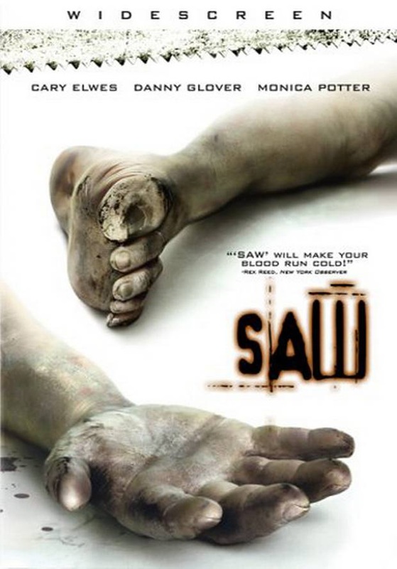
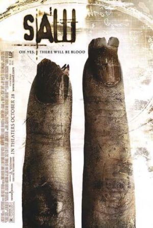
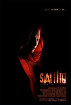
Twisted Pictures
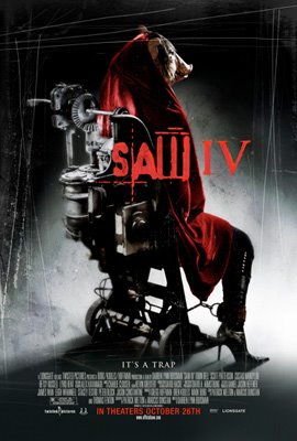
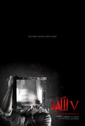
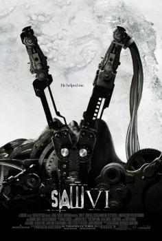
Twisted Pictures are most noted for the 'Saw' franchise (2004-2010) but have also produced other horror films such as 'Texas chainsaw 3D'(2013) and 'Dead silence' (2007).The name itself makes you think of horror, the word twisted relates to actions on screen such as murders and could also apply to the characters themselves.The use of the barbed wire is also significant as it relates to horror films as it is rusted and sharp when making our production company we should take this into consideration. The text is also fairly blunt and not too flamboyant this is effective as it gives of a more serious and chilling tone.(W.T)
Initial Production Company
This is our first attempt at a Production company, even though we liked it we have chosen not to use it. We used the clip that we found in Final Cut Pro so it wasn't very inventive and a lot of people have most probably used it before. Also its very ironic and not very professional because it is called 'Bloody Good Films' and yet there is no blood what so ever in the whole of our opening title sequence. There is also no music as we couldn't find one that we believed fitted nicely with the clip. (H.C)
This is our second attempt at a Production company, it is a lot better than the previous one as it looks more horror based. Some people said are last one looked like dripping paint. We also added some non diegetic sound to the clip, this makes it more realistic and we also think more professional. This will be our final choice, most if not all liked it over the previous one.
I decided that the plain bold font looked best, crazy fonts can a lot of the time look rubbish and unprofessional. It is a very similar style to 'Ghost House Pictures', the white text looks the best on the dark background. We found that other colors were hard to see and in the end this was what we went with. (HC)
I decided that the plain bold font looked best, crazy fonts can a lot of the time look rubbish and unprofessional. It is a very similar style to 'Ghost House Pictures', the white text looks the best on the dark background. We found that other colors were hard to see and in the end this was what we went with. (HC)
